Showing posts with label inking. Show all posts

Monday, 12 June 2017

MA Week 72 – selling work at the Art Market and looking ahead to hand in


Reflection on the past week, 12th June 2017

 The Art Market

As I mentioned a couple of weeks ago (see this week 70 blogpost) ), the College holds an Art Market as part of the end of year show and I had decided to submit some work. It was quite exciting preparing for this. I took the best 5 prints of the gentrified office building (now titled 'Gentrification'), plus I decided to take the prints I did for the Manchester Metropolitan University (MMU) PGR conference back in February (see this week 58 blogpost) . I wrapped them in cellophane and they looked pretty professional. I decided to price the work for that particular market, especially as the College were not taking a percentage.
 
Prints packed and ready to go to the Art Market
 
Friday was the opening night of the show and of the Art Market. As mention below, I met Michelle beforehand and the Art Market was in full swing by the time we got there and met some of my fellow students. I was thrilled when the sister of one of my classmates bought a 'Gentrification' print plus one of the MMU prints. It made all that time in the print room seem worthwhile. 

On Saturday morning it was my turn to do a stint on the till at the Art Market and I was joined in this task by a student I didn't know but who was very pleasant and easy to work with. I'd not been there long when my lovely tutor, Sharon, appeared. She also bought a print of 'Gentrification' and I was secretly very pleased although I pretended to be tut at her! It was really interesting to see what people were buying - a real mix of stuff, it wasn't the case that one particular genre or medium was flying off the shelves. 
 
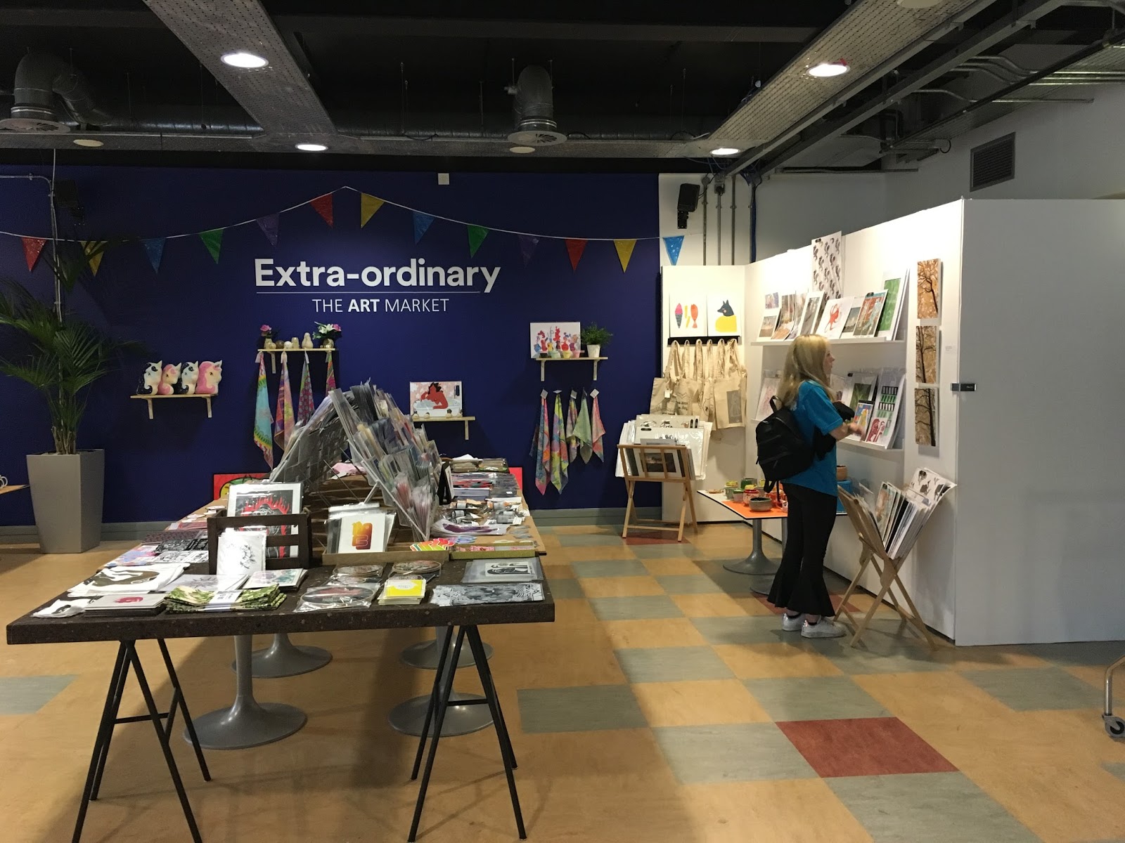
View of the Art Market - my prints are the green ones above where the girl is standing
 
I had a quick look when I went in for my tutorial today (more on this below) and could only find one 'Gentrification' and two of the MMU prints left – looking quite exciting!

Printing

After dropping off the prints at the Art Market on Thursday, I went back into the Print Room, and I was in there on Friday too. I’ve been doing some further work on the Burley drypoint (see this week 69 blogpost ). I worked further into the plate, to try to get some lighter and darker marks. Then I tried it drypoint with a painted monoprint on top. I experimented with mixing the coloured ink (cobalt blue) with a transparent ink extender to give a lighter background. This worked OK, as did variable inking of the background. However, most of my efforts at the painted monoprint were rather too indefinite, and the drypoint seemed to come too far to the foreground in the print.  On Friday I tried the transparent ink again, this time with a very high proportion of it, but it got quite sticky and difficult to work with. It did give slightly better results than the previous day, but I’m not sure if these are really two separate prints that I'm trying to put together. I don’t know where, if anywhere, this is going to go next. A possibility might be another drypoint plate as the foreground, or perhaps trying a different colour foreground or mixing some transparent ink into the black so the two layers might “equalise”.


Experimenting with inking the Burley drypoint

I also took the first prints of the aquatint of Royal Park that I was working on a couple of weeks ago (see this week 70 blogpost). There were supposed to be three tones within the print – it had been bitten three times after applying the aquatint solution - but it seems that all the tones had rather collapsed into one. After discussing with Mike, I put another liquid ground onto the plate and worked back into it to try to get some darker contrast into it. However, the result now looks rather too dark – I haven’t been able to get a satisfactory print and basically the plate looks over-worked. I was disappointed with myself but I can learn from this. Really I need to do a test strip beforehand for the aquatint and possibly print it at each stage, although the thought of all that stopping out fills me with dread.

 
The aquatint before I worked into it again - should've left it there!

Catching up 

As I mentioned above, I met Michelle beforehand to catch up with what's happening in her practice. As always it was a good conversation and we discussed opportunities. She had previously encouraged me to submit some of the work based on our dérive for the group show at Left Bank on the theme of 'Movement'. I showed her some of the work I’ve mentioned above and we talked about whether these would be suitable and how I could develop them.

Another catch up was with my tutor, Sharon, at my tutorial on 12th June. As ever, there was lots of food for thought. A large part of the discussion was around what I will submit, as the deadline is now only two months away. There was also a lot of discussion around the idea of the Royal Park aquatint as a journey. Further ideas were around embossing the paper on the Burley monoprint instead of having two layers of print. Much to do!

Monday, 8 May 2017

MA Week 67 - Two weeks for the price of one


Reflection on the past fortnight, 8th May 2017
 
I’ve just realised that I’ve lost count of the weeks somewhere, and that I was going to end up having 81 weeks in an 80 week course, so I’ve combined the past two weeks. I’ve done quite a lot, too.
 
Sketching and etching
I did a final sketch of St Paul’s (see also this week 65 blogpost) which still wasn’t brilliant, but allowed me a further chance to play with perspective. I don’t know why I found it so difficult; possibly it was because I was trying to alter the perspective from the photo I was using. Next day I transposed it to one of the little copper plates and worked on this for a couple of days. It still wasn’t a brilliant drawing, but the etching worked and I got some prints out of it. I used the needle with the slanted edge (I think it’s called an echoppe) which worked well when making curved shapes. I also used a roulette wheel to give some texture to the blossoms and leaves and I was surprised by how deeply it bit. It took so deeply in relation to the etched lines that I didn’t think they had bitten. I imagine I probably dug too far in with the wheel.

One result of this was that the blossoms were obscured. I thought about drypointing them in, but Mike suggested regrounding, re-etching and re-biting the plate. This seemed like a good way to learn about multiple grounding. I used liquid hard ground again and the resulting re-work certainly gave more definition. However there was a lot of “foul bite”, with dots here and there. I then realised I’d not cleaned the plate before re-grounding, so presumably there were dots of grease that resisted the ground. Possibly not ideal, but a lesson learnt. Also the dots gave some texture, so possibly a slightly happy accident.
 
Springtime St Paul's
 
I had intended to grind this off the plate and do a completely different design, but I’d learnt so much from this little plate that I’ve kept it, for now at least.
 
On Saturday and Sunday I attended the “Etching Weekend” at the West Yorkshire Print workshop in Mirfield. It was excellent. I worked with two images; a photo of Assisi I’d taken on holiday a few years ago, which I knew would work up into different areas of tone, and an image of some tulips from my mini-dérive with Michelle.  
On the Saturday we prepared and etched a hard ground plate, for which I used the Siena image. I’d already practised a lot of this technique but I learnt a lot of hints and tips. We also prepared a soft ground plate. It was really interesting to see the nuances of different workshops. 
On Sunday we started with the soft ground plate, into which I pressed some plant materials that were just growing outside the window. I then traced the photo of some tulips into the ground. I was surprised how dark and crayony the marks bit; the soft ground is very fragile compared to the liquid hard ground I’ve been using in college.
 
Assisi aquatint
 
The next stage was aquatint, and I decided to aquatint both plates. Our technician, Kate, applied the actual rosin powder but I would like to learn how to do this. I’d worked out the tones I wanted for the Assisi print and it was a bit tedious applying the stop out varnish to achieve this, not really knowing what the outcome would be. I was very pleased with the result considering it is a first effort. It printed rather too dark but Kate showed us how to adjust the transparency of the ink to allow lighter-toned printing.
 
Sepia tint tulips
The plant material images and the heavy drawing marks of the tulips don’t necessarily belong on the same plate, but they don’t look too bad together and this serves as a really good test/ideas plate for future soft ground use. Kate helped me to print it in colour. I would have liked to have picked her brains further on that point, but time didn’t permit. All in all an excellent weekend.
 
 A moan retracted
 
I mentioned in this week 63 blogpost that I’d submitted a conference abstract and heard nothing. It transpires that an email must have got lost somewhere in the ether as it had been accepted! This caused a panic as the conference had been extended to two days and my panel clashed with the walking event with Zoë and Lynne. Fortunately the organisers were mighty accommodating and have moved my panel to the morning so I can do both events. So that’s a paper to write added into the plan then!
 
Otherwise…
 
I was away over the weekend, which was great, so other than that I’m desperately trying to catch up with my creative journal. It’s good reflecting back with the benefit of hindsight but I really wish it was a bit more up-to-date!


Monday, 6 February 2017

MA Week 55 - a fruitful start to February


Reflection on the past two weeks, 6th February 2017  

At last, some definite progress to report! First things first, though – I finally got my marks back for my dissertation and I got a very good mark. I was really pleased. My tutor also seemed to “get” what I was trying to say and the way I was trying to say it. That gave me a real boost, which was much-needed, and I felt all my efforts last term had been recognised.

I had a good tutorial towards the end of January which helped to confirm the viability of an idea I’d had, to base an abstract painting on a map of the Mabgate area. Sharon (my tutor) liked some of the marks I’d made, and the plan is to incorporate at least some of these into the painting. There will, hopefully, be the usual method of choosing colours based on what I saw (see this week 46 blogpost for more info on what I actually did see), and incorporating the shapes I encountered into layers within the painting.

I’ve gone for 300gsm cartridge paper which is now stretched and which I’ll gesso to help me use charcoal and graphite on it. I like the acrylic paper but I didn’t think this would work so well if I were to try to use charcoal. We’ll see! This is all a learning curve for me – I’ve only stretched one sheet of paper since I left school – and I was unsure how long to soak this paper for. I’ve not used cartridge paper of this weight, but one of the things I want to do this term is to learn more about paper, so this is a good opportunity to learn something.

I’ve started a sketch of the proposed piece (it’s in two parts) and I feel quite happy with the shapes which are based on the streets. I have experimentation to do with the layering, and the colours I’ve put down so far aren’t right, but that’s the point of making a sketch. I have another tutorial in a couple of days so the next two evenings will be spent applying further colour to the sketch so I can talk this through with Sharon. I feel much happier working with this methodical approach although I am still concerned about time.

Colours in progress
 

I finally managed to get back into the print room last Thursday and I spent a good day in there. I printed the office block that’s being gentrified several times. Susie, one of the technicians, helped me get a better print by packing on top of the paper/plate with tissue paper. I did some experimental inking, some of which worked and some didn’t. I’m not sure where next with this plate but some of the latest prints are OK. These are all on 140 gsm cartridge paper but I’ve been recommended to use Snowdon paper so I will be giving this a try in due course.

 
An experiment that probably didn't work

On Thursday lunchtime I laser cut some shapes that I’d drawn based on the map of the Mabgate area. I also cut out the word “self”. There is a self-storage place next to the gentrifying office block and I kept coming back to the idea of “self”… storing some of yourself, or leaving some of yourself behind perhaps? Then it was back to the print room for an afternoon shift of monoprinting. I used the resists that I’d laser cut and I was quite pleased with the results. I didn’t clean the plate at all during the afternnon and this gave some nice layering. I used cadmium yellow and process cyan (my super favourites). This is because the self-storage place signs are blue and yellow, and also I wanted to get to a green that was reminiscent of the old City of Mabgate pub’s sage green exterior tiles. The colours mixed up to a nice leaf green – not exactly the colour of the tiles, but a nice Spring-like colour for the time of year.

 
self discovery

Using text in the monoprint was probably something that I’d resisted for a long time but I liked the result. I thought it gave a bit more interest to the prints. There were three that will be suitable for use at the MMU PGR conference although the registration could have been better! I think these prints represent a little development step compared to the work I did last Summer and I really want to work with more laser-cut shapes.
 
It was a bit of a downer that the print room was booked for a class on Friday as I’d got my print groove on and would have liked to continue where I left off on Thursday. However, there was a silent crit in class so I joined in with that. I worked with two first-year students, whom I’d not previously met, Diane and Hattie. Their comments were mighty useful. I showed two of the monoprints and two prints of the gentrifying office block. They felt that the colourful prints were reminiscent of nature and the organic, whereas the office block prints were hard and represented the physical. This was insightful for me as I am grappling with how to present the two types of prints together, and this could provide an entry point; the static and the chaotic, perhaps? They also recognised that the monoprints were based on map shapes, which was great! When I explained that the prints were based on the Mabgate area and why I’d used the colours, Hattie immediately mentioned the green tiles of the former pub, which was really encouraging. The only thing they didn’t “get” was the text. Perhaps it needs a bit more thought as to exactly how I deploy it.

 
Crit time: working with Hattie and Diane, enjoying looking at each others' work

It’s been good to be so productive after rather a fallow time. I promised myself February would be fruitful, and so far, so good.